Doing you a solid: The basics of color-blocking
February 7, 2025
 Henry Abbott
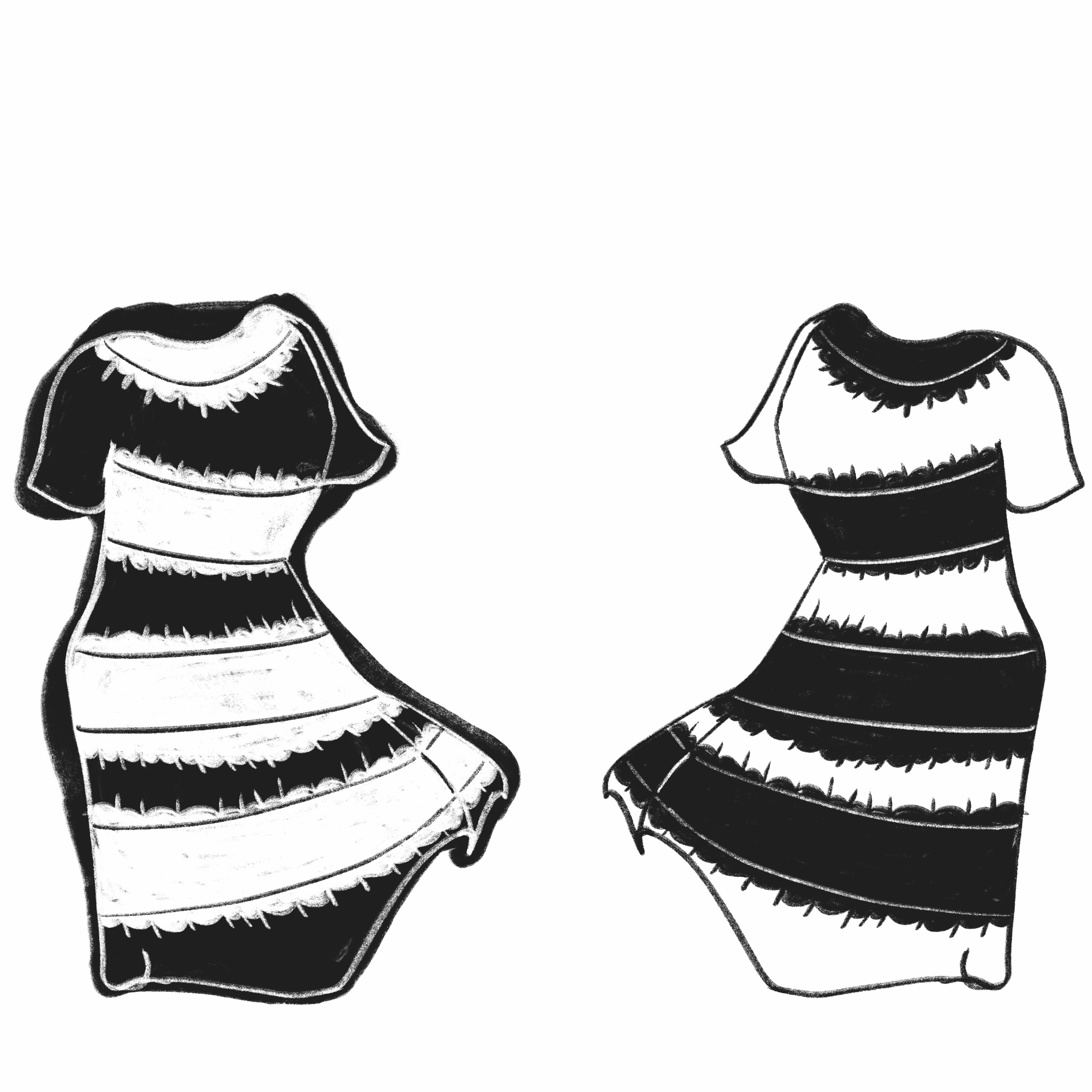
Blue and black? Or white and gold? Some deviants call it periwinkle and beige. As a true fashionista, I call it all contrasting and unified.
Despite being a short-lived internet phenomenon, there exist truly timeless components behind the design of the dress in the era of modern fashion. Approaching the decennial of the trend, the dress was not only a subject of scientific research and online discourse for its ambiguous colors but an article of clothing exemplifying the bold nature of one of my favorite tried-and-true dressing techniques: color-blocking.
If you want to embody the same striking and trendy essence of the dress through color-blocking, you are in the right place. Looking like a chic Rubik’s cube, tastefully shuffled Home Depot paint swatches or universal De Stijl compositions has never been easier.
The first step is a personal color analysis. Receiving an in-person analysis from a professional stylist is typically only accessible in larger cities and can be costly and time-consuming. Viral TikTok videos showing a color analysis as a part of an extensive Seoul, South Korea itinerary are a small number of cases. As a Midwesterner from a Rust Belt town, my favorite stylist is the widely accessible AI platform ChatGPT, which can present vibrant Pantone combinations that might make your eyes pop while conversely warning you of certain colors that dull your complexion by assigning you one of four seasonal palettes: winter, spring, summer or autumn.
To lead by example, I’m taking a bare-faced selfie in good lighting with open eyes. Using the free website Canva, I can use the color picker tool to select the colors of my eyes, hair and skin when I upload the photo. When going over each part of my body with the eyedropper, a hexadecimal code will appear. Then, I can send those codes to ChatGPT. I used the following prompt template to consult my virtual stylist:
“My base hair color is #000000, the highlights of my hair are #000000, my eyes are #000000, and my skin is #000000. What is my seasonal color analysis?”
The AI engine will then explain your seasonal palette by each body part and match you with ideal colors to wear and colors that might highlight your features. Personally, I’m an autumn who glows in a burnt orange but looks washed out in a baby blue.
Now, I know what you’re thinking…
“But Olga, what if my favorite color is mauve but my personal color analysis tells me to wear a near opposite, a yellow ochre? Do I have to burn all my clothes now?”
No. I personally believe God gave humans free will. The personal color analysis is merely a tool to emulate satisfying principles of art between clothing and yourself, not a wardrobe limit.
Moreover, if you find yourself in this complementary color dilemma, it creates a perfect transition into another aspect of color-blocking, following contrast with your body: contrast between articles.
For example, considering yellow is in your palette, putting on a sweetheart-neck top in a yellow ochre with mauve satin pantaloons below can be a method to retain your favorite color’s role in your closet without failing to maximize the properties of colors that emphasize your favorite features. The tendency of the sweetheart neck to reveal skin that glows with a yellow, which contrasts with a purple on a conservative pant, is, to say the least, a satisfying composition. Furthermore, some clothing already contrasts these solid colors on the same article, providing a two-in-one experience.
Beyond silhouettes, which are an entire discipline in themselves, unity and contrast on the basis of color do not necessarily solely apply to the letters that make up Roy G. Biv’s name, called hues. I say, manipulate Mr. Biv from time to time and find his true colors by bringing out the darker sides of his hues, called shades, while honing the more light (hearted) sides, called tints. You can also completely cut the fellow off and rely on just the values black, white and gray. Never apply this doctrine to your own relationships, but definitely experiment with it for clothing.
For the sake of memorializing the dress, my hypothetical recipe for an outfit matching both my own autumn palette and the famous meme would utilize white in a mini skirt and gold in a waist chain, as well as hints of black in some Mary Janes and blue in a cropped turtleneck to appease the masses.
Considering your personal favorites, how would you utilize your own color palette and color-blocking doctrine to make your inspiration uniquely YOU? This is the first pillar of Stepping Stones for Style.

Comments
Before submitting a comment, please review our comment policy. Some key points from the policy: